LinkedIn is a professional platform, and as such, it does not necessarily encourage an outpouring of visual creativity. However, we believe it is crucial that you should have control over it.
In light of this, we ought to have the freedom to design our profiles, content, and “reputations” however we see fit – as long as we do so within reason.
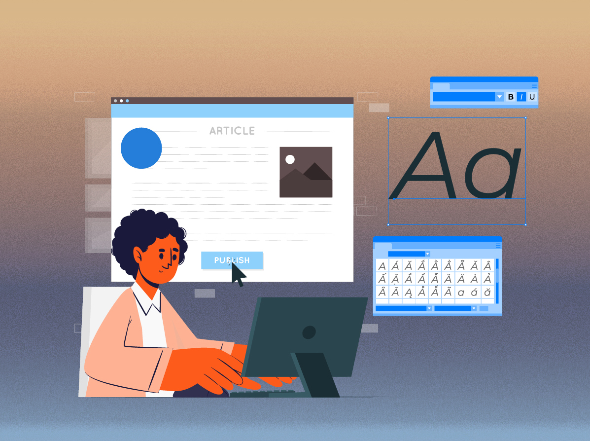
You may have noticed that you can now add color, icons, and symbols to your profile to make it stand out. But remember text formatting for LinkedIn posts requires skill.
Therefore, if you do it correctly and make sure your bold and italic text stands out, your LinkedIn post will attract a completely different kind of attention.
There are many different ways you can format your posts, whether you want them to be more interesting to read or simply stand out more.
In this article, expandi will go over how to format text for LinkedIn posts using bold, italic, and underlining.
HERE WE GO…..
Why Do I Need to Consider LinkedIn Formatting?
Because appearances are crucial.
This is the reason we take the time to thoroughly optimize everything we can, including our profiles before we submit them. To ensure they look good, however, even seemingly unimportant things like blog posts must be formatted correctly.
Similar to other social media platforms, LinkedIn only accepts plain text as its primary input. This makes things more universally accessible and contributes to the standardization of the text you see. Nevertheless, just because something is standardized doesn’t preclude you from contributing your own original ideas. You can have posts that look better, more appealing headlines, and summaries that are colorful and don’t look generic by using proper formatting.
As a result, your posts are more effective because they are read more frequently than plain-text posts.
A sizable portion of LinkedIn users accesses the site via their mobile devices. And thus, be sure to take mobile optimizations into account before beginning LinkedIn formatting.
Advantages of LinkedIn formatting
Scannability
While Long texts can be difficult to find specific information in because they are written in a story format with minimal rich formatting.
However, all it takes is one bold word to know exactly where to look.
On LinkedIn, long posts without any of these three formats are hated. They are easily scared away! No one has the time to read a post that is 500 words long.
Short texts will therefore be simple to scan.
Audiences will read longer
Similar to when we used to underline specific sentences in our school textbooks. LinkedIn users typically scan the content at rapid speed, but it’s widely acknowledged that when readers’ brains notice a bold word, the speed slows, and focus increases. Because bold, italic, and underlining are similar to speed bumps.
Engage with emojis
Emojis offer your readers a unique perspective. It improves the article’s or post’s overall appearance. It is a fantastic way to format your content and express emotion even though they aren’t technically rich text formatting. Hence, emoji usage can help you stand out from the crowd.
Instead of headlines, use bold
Believe it or not, having a headline with 100 words below it degrades the professionalism of your article. Therefore one of the SEO techniques is to use bold words instead of lots of headlines, which can harm blogs, articles, and posts’ SEO.
The key phrases
Bolded keywords still add value to your LinkedIn posts and articles, albeit perhaps not to the same extent as when we use bold and strong-tag to optimize a website for Google.
Various Text Formatting for LinkedIn
Getting people’s attention can be difficult given that LinkedIn has almost 800 million users worldwide.
You’re not directly competing for any of those users’ attention, but you still need to take into account how your connections interact with one another as they scroll through their feeds.
If you want to get their attention, you may have no more than a few seconds.
Let’s look at the various types of rich text, what they stand for, and when to use them before we discuss how to format text in your LinkedIn content.
Let’s take a quick look:
Bold font
The primary purpose of bold text is the focus. It serves as a tool for drawing in readers by emphasizing keywords and phrases. When you want to emphasize something, you should always use bold text. As you may have noticed from this article, we highlight crucial phrases or keywords in bold. Some people tend to overemphasize everything, which results in an excessive amount of bold text and does more harm than good.
Simply put, use bold text in your LinkedIn posts sparingly. The majority of readers will skim your text, so you should use bold to ensure that the most crucial information is visible right away.
Italic font
In conversational sentences, dialogues, quotes, or names, italics are frequently used.
They are both rare and a little trickier than bold. You can treat italics as a weaker form of emphasis or as a way to convey what the reader might be feeling or thinking because the bold text in the LinkedIn post is highlighted and easier to see.
Underline font
You’ll discover that underlined text is even more uncommon! Because it will frequently be obvious as a link. Therefore, it isn’t very common online. Textbooks and newspapers are the main places it appears. We advise limiting this in the case of writing for the web. In case your readers mistakenly believe it is a web link.
Most of the time, LinkedIn text in bold or italics will communicate ideas more effectively.
Use emojis ✅
Here is a tip, use emojis as they give what people read on LinkedIn on a daily basis a little more variety.
They’re pretty much usable.
How to Format your LinkedIn posts?
The best way to bold text on LinkedIn is to format it on other websites and then paste it there.
Yes, it is that easy.
expandi will demonstrate how to bold, italicize, and underline text in your LinkedIn profile and posts using the LinkedIn Text Formatter.

The following are the steps:
1. Make a backup of the section of your LinkedIn profile that will include the fictitious formatted text. All should be copied and pasted into a word document.
2. In the box below, type the text you want to format. You’ll see the text instantly change to bold, italics, underline, and script as you type.
3. Use the right-click menu or the Ctrl+C keyboard shortcut to select the formatted text that you want to copy.
4. Log into LinkedIn and open your profile or start a new post.
5. Use the right-click menu or the Ctrl+V keyboard shortcut to paste the text into the area of your choice.
6. Your LinkedIn profile’s text is formatted.
What to consider before formatting your LinkedIn posts?
Your LinkedIn profile may look better if you use these tools, but there are some potential cons as well.
The following are some considerations to make before using these tools:
-
You might stop being searchable
These online text generators can alter the text to the point where it is no longer easily accessible by search engine bots. Keywords in your profile text, headline, and summary help search engines identify your profile content. It might be a good idea to hold off on font editing for significant keywords that describe your job position or skills.
-
It might appear unprofessional
The use of various text formats in excess can appear unprofessional. If your profile is cluttered with decorative font, potential clients might perceive them as being too immature. Your LinkedIn profile may look better if you use these tools, but there are some potential cons as well.
-
Older devices may not display the font.
Unicode can be read by most modern devices, but some older ones can’t. Some older Android devices are unable to properly interpret the formatted text.
The text will display as tiny black boxes on those devices, making it virtually impossible to read.
-
Screen Readers Cannot Read Formatted Font
The software cannot properly read Unicode to users because screen readers do not comprehend it. Users who rely on screen readers, such as those who are visually impaired, cannot access these formatted fonts.
Conclusion
LinkedIn is a professional platform that encourages visual creativity, so it is important to have control over the formatting of posts. Consider LinkedIn formatting as it requires skill and can be used to create better, more appealing headlines, and summaries that are colorful and don’t look generic.
Additionally, there are several advantages to using LinkedIn formattings, such as scalability, access to the site with mobile devices, and minimal rich formatting. Bold text is an effective way to format content and express emotion without using too many words. It is a great way to get people’s attention and draw in readers by emphasizing keywords and phrases.
expandi hopes you were able to understand how to bold, italicize, and underline text for LinkedIn posts.
So, hurry up and enhance your LinkedIn posts!